2026 / Design for Print, Branding
Dexam
Wok range packaging
The brief
Create a distinctive packaging direction that would give the wok range a consistent identity across different sizes and product variants. The design needed to make a strong visual impression while keeping the Dexam brand and essential product information clear.
Working within the existing cutter guides, the packaging also had to fit the physical shape of each wok, with front and reverse panels considered together.
We have worked with Dexam for more than 30 years, building a detailed understanding of the brand and its products. For this project, we led the development of a new look for the wok range, from initial moodboards and creative concepts through client meetings and design development to the final artwork.
Exploring the direction
The process began with moodboards and a range of creative concepts, exploring how colour, typography and imagery could express the energy of wok cooking. These ideas gave Dexam different visual directions to consider before one was taken forward.
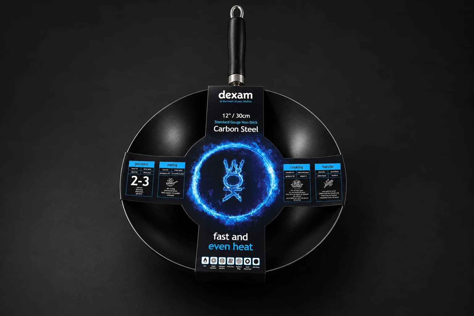
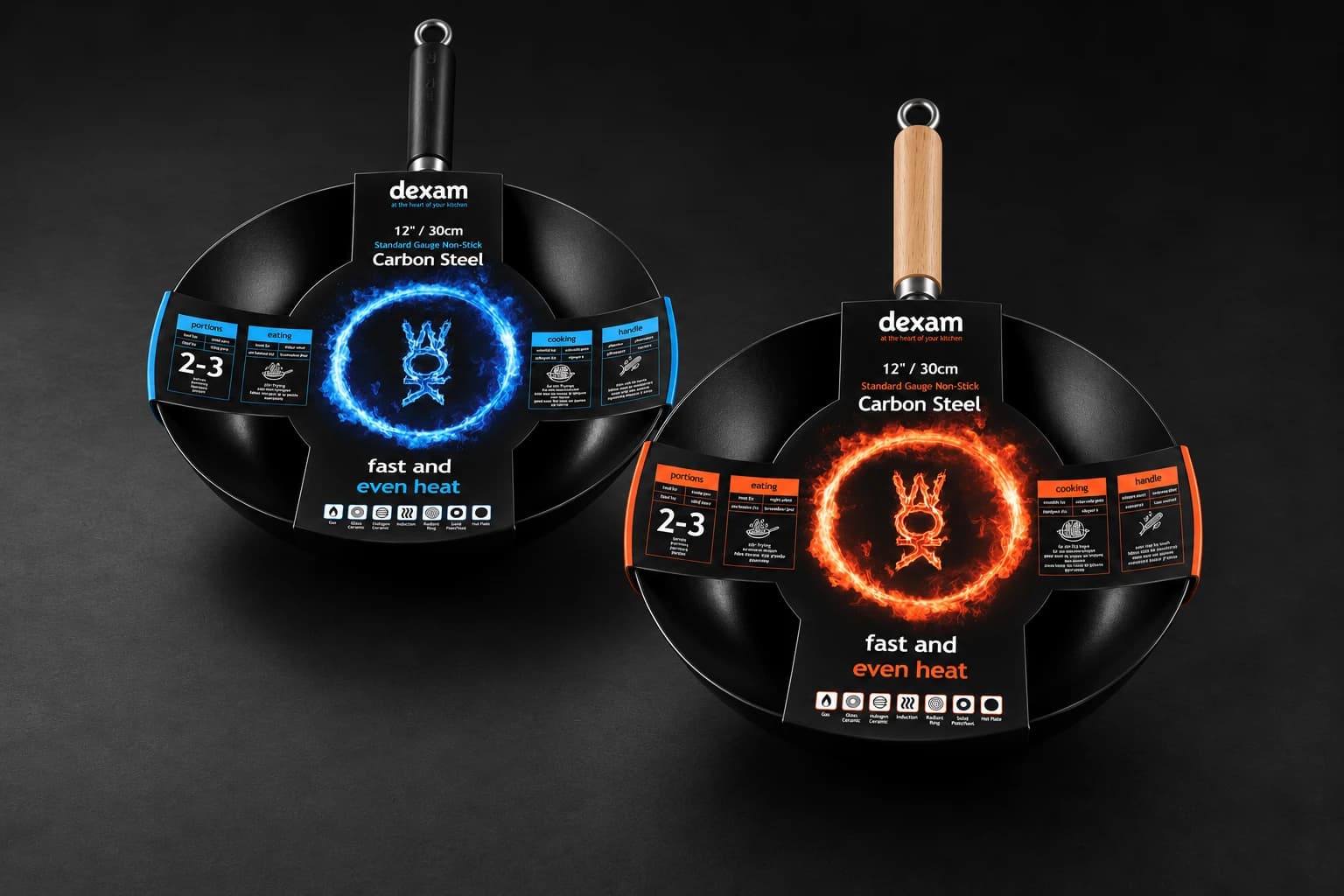
Client meetings and feedback shaped the development, allowing the chosen concept to be refined in detail. The final direction combined a black background with a circular flame graphic and contrasting blue and orange accents. The Dexam logo remained prominent, supported by a clear hierarchy for sizes, product details and supporting information.
A custom treatment of the word WOK sits inside the flame ring, creating a focal point that works with the wok’s circular shape. The side panels organise the practical information, while the coloured accents connect the different parts of the wrap.
From approved concept to print
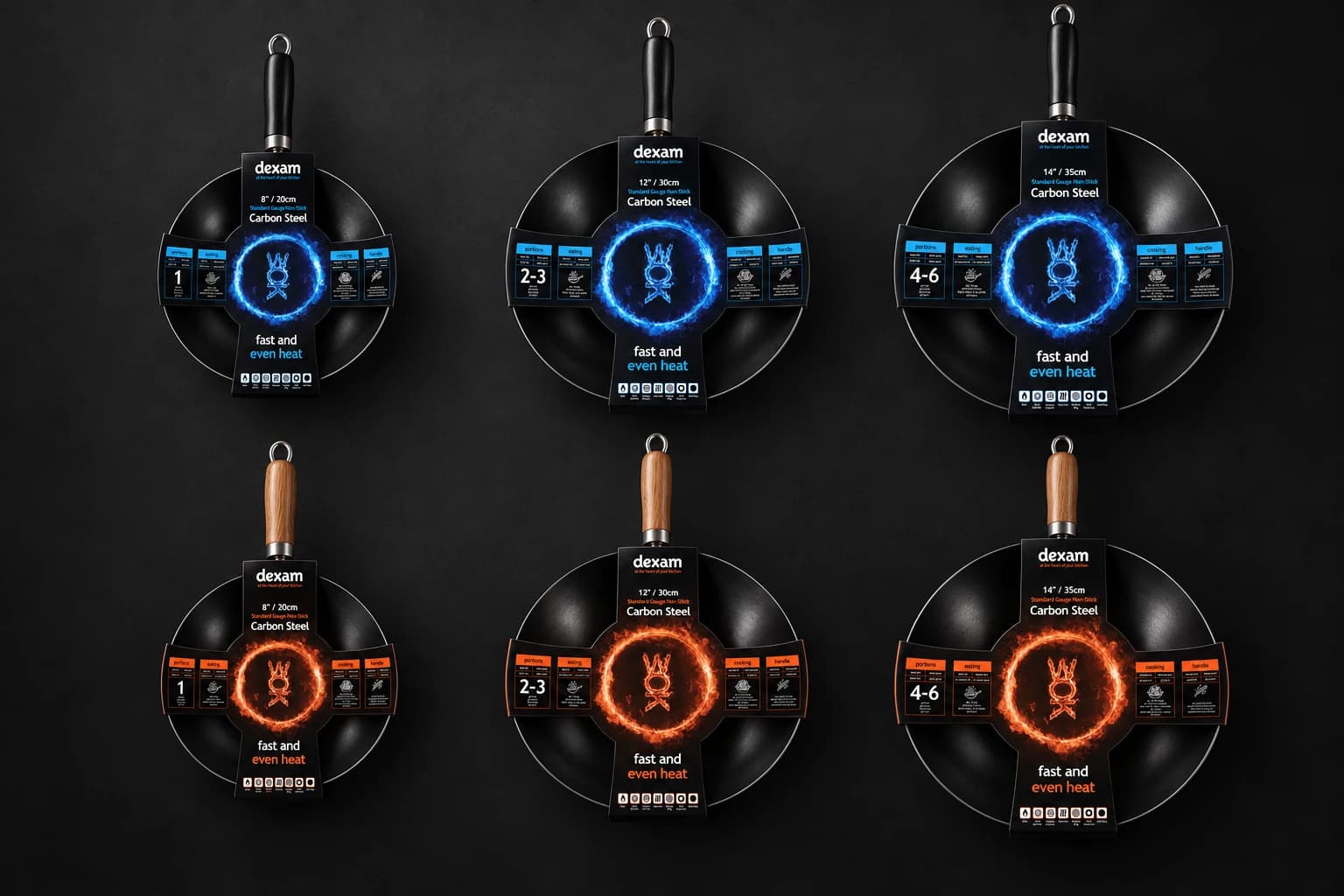
Once the concept was agreed, we created the print-ready artwork for the full range: six variants covering the 20cm, 30cm and 35cm woks.
Each version was adapted to its cutter guide, carrying the same visual language across the different dimensions. The work included the individual product details, side information panels and multilingual care instructions, with attention to how each part of the design would sit when the wrap was folded around the product.
This detailed artwork stage carried the approved creative direction through to a complete set of files ready for print, with consistent branding across both colourways.
The finished range
The finished packaging brings the six products together as a recognisable family, using the flame graphics and colour to give the range its character while keeping the information organised.
For Dexam, the project continued a working relationship spanning more than three decades. For The Tailored Agency, it demonstrates the value of experienced creative involvement throughout a project, from the first conversation to the completed production artwork.
Services
- Design for Print
- Branding
Deliverables
- Creative direction
- Moodboards
- Concept development
- Packaging design
- Range development
- Print-ready artwork
Gallery